Table of Contents
.tabs
$p.gui.tabs (tabbed interface module)
This module provides functionality for simple tabbed interface GUI elements.
The tabs
The recommended markup for the tabs is either an <ul>, or an <ol> list, with <a> for the actual tabs. More important, however, is that the attributes are set up as follows:
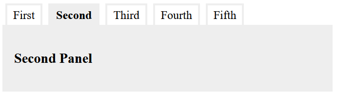
<ul role="tablist">
  <li role="presentation">
    <a role="tab" href="#panel1" aria-controls="panel1" id="tab1" aria-selected="false">First</a>
  </li>
  <li role="presentation">
    <a role="tab" href="#panel2" aria-controls="panel2" id="tab2" aria-selected="true">Second</a>
  </li>
</ul>
The attributes here have the following meanings:
- The various
role-attributes define the semantic roles of the elements:- The role
tablistindicates that the element contains a list of tabs. This attribute needs to be set on the top-level of the tabs structure (in this case, in the<ul>element). - The role
presentationremoves the default semantics of an element. In this case, it indicates that the<li>should not be treated as list items. - The role
tabindicates that the element is used as a tab which interactively shows a specific tab panel when activated.
- The attribute
aria-controlsprovides a reference to the tab panel (using it’s ID). This is used by the script code to determine which panel to show when the tab is clicked. - The attribute
aria-selecteddefines if a tab is currently selected. - The
idof each tab is used top back-reference the tab from the panel. - If
<a>is used as a tab element (which is the recommended choice), itshrefattribute should also link to the target panel as fragment URL (i.e. theid, prefixed with#).
The panels
As with the tabs, the elements used for the panels can be arbitrarily chosen. In most cases, a block-level element, like <div>, <section> or <article> is probably the best choice.
<div role="tabpanel" id="panel1" aria-labelledby="tab1" hidden>
  …
</div>
<div role="tabpanel" id="panel2" aria-labelledby="tab2">
  …
</div>
These need to be marked up with the following attributes:
- The attribute
role=“tabpanel”marks up the panel as a tab panel. - The
aria-labelledbyattribut links the panel with it’s tab. It should contain the id of the panel, as described above. - Each panel must have a unique
idthat can used to refer to it from the tabs (see above). - The
hiddenattribute is used to hide all panels that are not initially visible. This is an empty attribute.
Activation
Any structure as the above that is present at the time that the (pre-)initialisation takes place, will automatically be detected and the necessary callback functions will be added.
If a tab interface is dynamically added to the page, it can be activated by calling the following method:
$p.gui.tabs.add(e);
In this case, e must be a reference to the root element (the one with the role=“tablist” attribute)
- Notes:
- This module does not provide any CSS to style the tab interface. When designing the user interface, it is recommended that you use the
aria-*androleattributes as selectors. - Do not use aria-hidden=“true” for hidden tab panels. This status is already implied by the hidden attribute.
See also
- $p (page core)
More information
- Node: ARIA: tablist role on MDN.
- ARIA: presentation role on MDN.
- ARIA: tab role on MDN.
- ARIA: tabpanel role on MDN.
- hidden on MDN.